Blog articles in 2018

2019 Pantone Color of the Year - Living Coral

Brintons Americas discusses weaving Pantone’s 2019 Color of the Year, Living Coral, into lively wool-rich Axminster patterns.

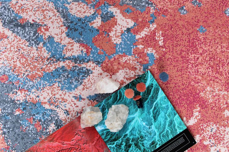
Pantone defines Living Coral as a warm and nourishing shade of orange. With an air of optimistic energy, Living Coral promotes human connection and pushes us to reflect on our current environmental status. In our natural world, Living Coral brings to mind ideal underwater landscapes and bountiful life-providing botanicals.

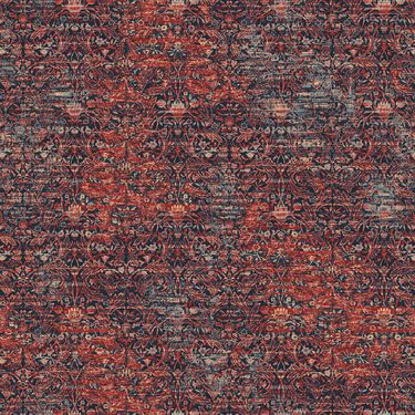
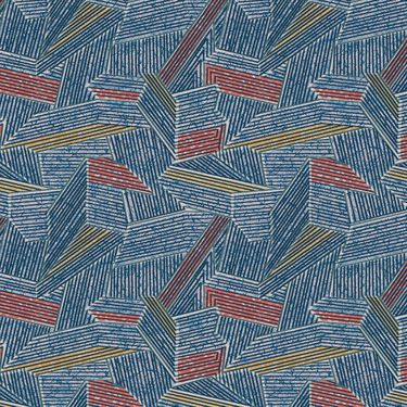
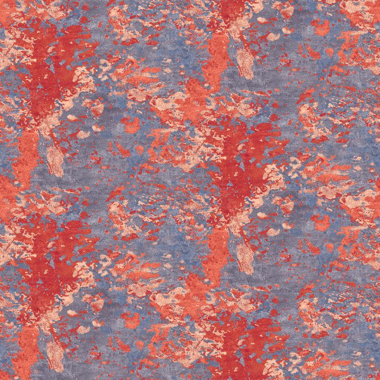
In commercial carpet, we see Living Coral, or Brintons Pom #25-2510 (D21), popping up in the abstract line work of loose lay Axminster rugs, used in textural layers to update traditional patterns, and splattered boldly across dynamic graphic elements.

With carpet being the largest unifying element in the interior, a hue as saturated as Living Coral can quickly overpower a design and throw off the balance. However, in extremely high-traffic areas like convention centers where the energy of the color is synonymous to the energy of the space, designers may flood the floor with this saturated hue in an analogous scheme instead of only using it for highlight and contrast.

While Living Coral can be intimidating in application, we encourage creatives to be daring and not shy away from using bold color in flooring!

Las Vegas based designer, Sam Hoeffer, shares her insight on using her favorite pom in the box. “I’ve found that our #25-2510 (D21) is a popular choice amongst our Hawaiian based designers. It’s especially successful when anchored in a sea of vibrant blues.”

Our Pantone poms match, 25-2510 (D21), is one of over 500 standard 80% wool 20% nylon blend poms available to designers.

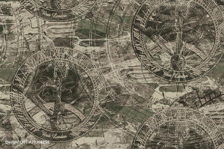
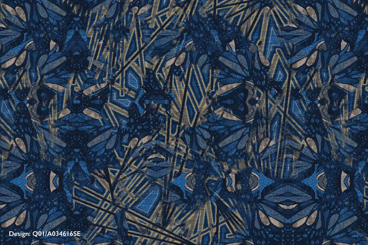
We also proudly manage one of the largest pattern archives in the industry, much of which is digitally archived and available to be customized on Design Studio Online (DSO). Login to your account, search through the archive, and get inspired by color.

How would you use Living Coral in a carpet pattern? Let us know by tagging us with your colorful creations on Instagram (@brintonsamericas)!

BDNY Recap

On November 11th and 12th, hospitality design professionals gathered at New York City's Javits Center for Boutique Design's annual trade fair.

Located in a corner lot at the front of the trade show, the Brintons booth (#1020) was an experience that highlighted our unique manufacturing process and celebrated the creative basis of Brintons designs.

Brintons latest collection, Materialize by Stacy Garcia, was launched at the fair and served as the perfect inspiration for the design of booth #1020. Featuring natural wood grain textures, subtle metallic finishes, and bold bursts of primary color, the Brintons booth earned the honor of being a finalist for best exhibit out of 114 other flooring and carpet vendors.

To visually demonstrate Brintons' place as a manufacturing and design pioneer within the industry, Brintons wool and other products were also showcased in the booth. Brintons blended, spun, and dyed yarn created the wall covering in half the booth, and accompanied designs from the Brintons Self-Expression Project and the 100% wool cut and loop Wilton collection.

Saturated color, natural surfaces, and the contrast of geometric and organic elements were the common thread among exhibitors at BDNY this year. We expect that these features will continue to inform the industry.

Has the Brintons booth captured you attention? Contact your local sales rep here, we'd love to discuss design trends and learn about your upcoming projects!

Inktober Roundup

In 2009 the rules were simple – make one drawing, in ink, for every day of October. Almost one decade later, what began as an exercise in positive drawing habits for creator and artist Jake Parker, has morphed into a global phenomenon with every-expanding ways to approach and interpret the Inktober challenge.

Prompts are provided each day, some are in a spooky spirit, such as “Spell” or “Drooling”, while others are more irreverent, like “Chicken”. Ultimately, the decision to use the prompts as inspiration is up to the Inktober participant, as is the medium, and how much color is used in the piece.

We’ve rounded up the Brintons Designers’ Inktober pieces and discussed how a daily creative challenge influences their work in the axminster world.

Designer Agnieszka Wojtal created primarily figurative work, utilizing contour lines to create movement within her subject’s luxurious hair. Similar line work can also be found in designer Sam Hoeffer’s Inktober pieces, referencing the line and hatch textures that often add dimension in carpet.

Terrien Hale, designer, did not shy away from color in her work, creating abstract landscapes that might be reworked into a gaming design.

When asked about the Inktober challenge, Kathryn 'Katie' Nehrbauer, designer, stated that drawing on a computer versus paper is always an adjustment, “At first it was a challenge since I've spent so many years drawing on a computer. Things you can easily do on a computer, like erase your work instantly, is not possible when you are drawing on paper with permanent ink. It took a little while for me to get comfortable, but after I few drawings I began to really enjoy it”.

Katie also found some similarities between working in ink and designing for carpet, “I think that with any artistic process, your mind runs on instinct. For me, I had textile design in the back of my mind the entire time. I found myself thinking, ‘Wow, this could be a great rug design’. I also noticed that I approached drawing in a similar way as designing carpet. We design carpet in layers that build upon each other to create a final look. I started each drawing with light marks to outline my basic shapes and then layered different size pens to create the detail and definition that I wanted.” Katie stuck with a black and white color palette, something that rare in carpet design, but found she became more and more comfortable with the limited scheme.

Inktober presents an opportunity for creatives to explore and expand their thinking – Brintons designers can’t wait until next year!

All a Blur

Don’t adjust your glasses. Don’t run to your doctor for a new prescription. It’s not your eyes, these designs from the Brintons archive are just blurry.

We dove into the design library and delighted in the many patterns that had blurriness as a common thread and found, that while “blurry” could be used as a surface level description, the moods that blurriness can conjure in an environment are plentiful.

Blurry can be tranquil and soft, evocative of a foggy morning or a dream-like state.

More literally, a blurry design can distort the barriers between two distinct spaces, creating a setting where people move freely and experience the facets of an area more fully.

Our favorite discovery, perhaps, were the blurry patterns that expressed movement and dynamism. Think of the flash of a taxi rushing by you, or the thrill of a photo-finish. Or even Giacomo Balla’s Dog on a Leash, where his goal was to capture many moments of movement in one frame.

We’ve compiled the highlights of Brintons blurry designs and encourage you to take a look. Browse as slowly as you’d like; no matter what, it will all still be a blur.

The Self-Expression Project Group 5

All in due time: As the year long creative venture comes to a close, the last group of self-expression project designers respond to a more literal representation of time - the sundial. Designers studied the object for two weeks before diving in and translating their thoughts into axminster carpet.

To see the 12 month evolution of the project and a glimpse behind the conceptual scenes, check out Interiors + Sources' article Encouraging Expression here.

"My challenge for this project was to make the sundial into an abstract version of itself. By concentrating on the light striking the shiny gold arcs of the sundial, I was able to abstract the Da Vinci inspired mechanical drawings enough to achieve my final axminster design"

Donna Davis, Senior Designer, Brintons Americas

Design: Q01/A035680SE

"Natural light, changes in the weather, and even the texture of concrete it laid on guided my color and texture decisions. Studying the angles of the shadows cast throughout the day, I took the literal shapes and twisted them around using different opacities to create layers."

Cherise Porretto, Senior Designer, Brintons Americas

Design: Q01/A22370ZSE
​

"When given the sundial to respond to, I immediately envisioned a casino design with a large and detailed repeat. I wanted to create something that would draw in people’s attention and pique their curiosity."

Solongo Drini, Senior Designer, Brintons Americas

Design: Q01/A20366ZSE

I was inspired by the sundial’s representation of time. This lead me to think of butterflies and the chaos phenomena 'The Butterfly Theory'. The butterfly wings in my design symbolize alternate theories overlapping each other and the linear angles represent the gnomon of a sundial as they both intersect randomly."

Nandita Gharat-Hurt, Senior Designer, Brintons Americas

Design: Q01/A034616SE

We use this blog to share information about our work for the benefit of customers. You can use our archive below to browse previous articles.

Recent blog articles